

What is FlexBox
FlexBox is a flexible Box module which is designed to arrange one-dimensional elements in row or column. It offers powerful capabilities related to space distribution. It deals with either a row or column at a time .
Why FlexBox is powerful
FlexBox in css is more efficient when we have following use cases-
- It easily places elements vertically centre (we don't need to make any calculations based on the screen sizes to place it vertically centre)
- Creating horizontal and vertical layout and space management becomes more easy (we can easily distribute spaces between elements)
- we can easily grow or shrink elements depending on the space availability
- It is easy to change ordering of elements in a row or column.
Basics for FlexBox
Before starting with FlexBox properties , we should know these terms flex-container, flex-items, Axis, etc.
Flex Container
The Flex Container is parent element which contains child elements that we want to place in row or column.
Flex Items
The individual elements inside flex Container , are called flex Items
Axis
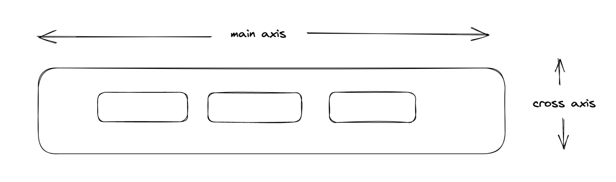
There are two axis to FlexBox - main axis and cross axis.
If we have flex-items in row , then main axis will run along with row and cross axis will run along with column as shown in figure below
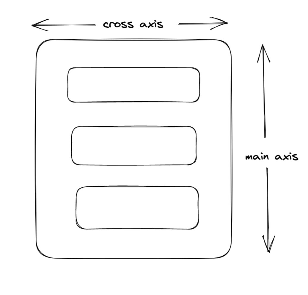
If we have flex items in column, then main axis will run along with column and cross axis will run along with row.
FlexBox Properties
Display
This property is assigned to Flex Container i.e parent. Once it is assigned to Container it adopts the behaviour of flexBox
Flex Direction
This property is applied to Flex Container. It is used to arrange the sequence of flex items in row or column. The default value of flex-direction is row.
Lets understand it by example -
- in the above example, container1 don't have any flex-direction , it is arranging elements in row by default.
- container2 is given "flex-direction: column" hence it is arranging elements in column.
- similarly container3 is given "flex-direction: row-reverse" hence it is arranging elements in row but in reverse order.
- container4 is given "flex-direction: column-reverse" hence it is arranging elements in column but in reverse order.
Flex Wrap
This property is applicable to Flex-Container. This decides whether the Flex items will remain to force in single row(single direction ) or they can wrap into multiple lines if space is less. the different values are wrap, nowrap, wrap-reverse. The default value of flex-wrap is nowrap.
lets understand it by example
in the above example
- for container1 , there is no flex-wrap property , hence it is taking default nowrap, the flex-items are adjusting in single row even if the width is 130.
- container2 has property flex-wrap:wrap; hence it it coming in 2 lines without losing actual width of flex-items.
- container3 has property flex-wrap:wrap-reverse; hence flex-items are wrapping in 2 lines with reverse order.
Flex Flow
This property is the shorthand for flex-direction and flex-wrap. flex-wrap and flex-direction these two are the common properties for every flex-box , we can write it together using flex-flow property.
lets understand it with example, %[codepen.io/yashashri18/pen/vYrwXoN] here,
- container1 is an example of flex-flow: row wrap , we see that all flex items are in row and wrapping in 2 lines.
- container2 is an example of flex-flow: row wrap-reverse , we see that all flex items are in row and wrapping in 2 lines but in reverse order
Justify Content
This property is used to control the extra-spacing between flex-items. It is used to manage spacing horizontally. The different values that it have are - centre, flex-start, flex-end, space-between , space-around. The default value is flex-start.
lets understand each by example,
in the above example
- container1 is taking default value i.e flex-start , all items are positioned at the beginning of container.
- container2 is taking justify-content: flex-end; , all items are positioned at the end of container.
- for container3 the value is centre , all items are positioned at centre of container
- for container4 the value is space-around , hence all items have equal space before and after them.
- for container5 the value is space-between , hence all items have equal spaces in between them.
- for container6 the value is space-evenly , hence all items have equal spacing - before, after and in between them
Align Items
This property is used to position flex-items vertically as per the height of container. The different values are - stretch, centre, flex-start, flex-end, baseline, etc . The default value is flex-start.
Lets understand it with an example - in the above example,
- for container1, it is taking the default value i.e stretch hence elements are stretching to overall height of container.
- for container2, it is having property of align-items: center; , all elements are positioned vertically center.
- for container3, value is flex-start, all items are positioned at the top of container.
- for container4, value is flex-end, all items are positioned at the end of container.
So these are highly used properties of flex-box , all these properties are applicable to Flex-Container. There are different set of properties for flex-items , we will discuss those in Part 2 of this article. Stay Tuned.
Thank you !!
Click here for Part2.