


What is a CSS grid?
Grid is a new layout model in CSS which works in two dimensions. It allows us easy space, position and size management of items vertically and horizontally.
The main difference between Flex and Grid is - Flex is unidirectional and grid is two-dimensional.
Few terminologies
Before starting with the properties of the grid let's understand a few basic terminologies that we will use. With the help of the below diagram, let's understand the terms quickly.
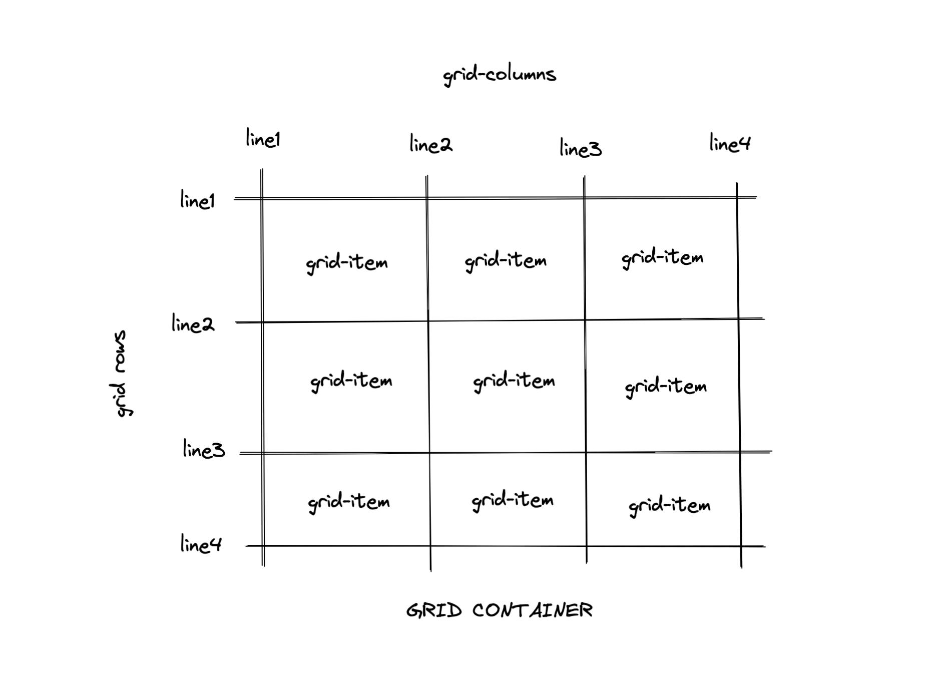
Grid Container
Grid starts with a grid container. It is the parent container that contains grid items (direct children). Grid container is created by setting display property. It can have values such as-
grid(children behave like block elements),
inline-grid(children behave like inline elements)
Grid Lines
These are the verticle and horizontal lines which divide the grid.
Grid Columns
These are the elements that flow in verticle direction i.e it is the space between two verticle grid lines.
Grid Rows
Similar to a grid column, a grid row is the space between two horizontal grid lines.
Grid Items
The child elements in grid are called as grid items.
Grid Tracks
Grid track is either a grid-row or grid-column
Grid gap
distance between two grid items is grid-gap.
Grid Properties
display
The display property is used to make the container behave like a grid container. It can have values - grid, inline-grid. let see an example -
In the above example, we can see that -
if we give value as a grid, then child elements behave like a block element
and in the case of inline-grid, elements behave like inline elements.
grid-template-columns
This property defines the number of columns along with their sizes. There are multiple ways to give sizes, let's understand by example -
in the above code -
in Example 1, the grid will have 3 columns with provided width in pixels
in Example 2, the first two columns will have 400px, and 200px width and the third column will take the remaining width
in Example 3, the second column will take 50% of the available width, and the remaining columns will divide the remaining width equally.
in Example 4, it will create 2 columns with equal width
in Example 5, every column will get the specified fraction of width.
grid-template-rows
this property specifies the sizes of rows in a grid layout.
let's see the example -
here also we can give sizes in pixels, percentages, fractions, etc.
grid-gap,grid-row-gap, grid-column-gap
These properties determine the spacing between grid rows and grid columns.
grid-gap sets the equal spacing between rows and columns but if we want different spacing between rows and columns then we can use grid-row-gap and grid-column-gap separately as shown in the above example.
justify-content
this property is useful for horizontal space management of grid items.
the value 'start', places grid items on the start i.e left side of the container. similarity 'end' and 'center' place items at the right-end center and of the grid container.
the value 'space-between' distributes equal spacing between columns.
the value 'space-around' sets the equal spacing on both sides of columns.
the value 'space-evenly' sets the equal spacing between container as well as columns.
align-content
this property is useful for vertical space management between and around rows within the container. The values are same as justify-content i.e. start, end, center, space-evenly, space-around, space-between.
let's see an example -
All the above properties listed above are very useful and apply over grid-container i.e Parent.
let's see some important properties of grid items. (child)
grid-column
This property specifies the size and location of the grid item within grid column by specifying values such as start-line, end-line, and span.
This is the short-hand property of grid-column-start and grid-column-end.
let's understand it by example -
in Example 1, 1 is start column line and 4 specifies the end column line
in Example 2, we have used grid-column-start and grid-column-end properties separately.
in Example 3, will start from line 1 and combines 3 span of 3 columns
in Example 4, 1 is the start line and -1 is the end-line
here, although the values are diffrent , all the outputs are same...MAGIC!! :😃 🪄
grid-row
this property behaves similar to a grid column, the only difference is it determines the location of the grid item within a row.
This property is also the short-hand for grid-row-start and grid-row-end.
grid-area
This property specifies the size and location of grid-item with the grid-container. This is the short-hand property of grid-row-start, grid-row-end, grid-column-start, and grid-column-end.
the syntax is grid-area: val1 / val2 / val3 / val4
val1 - start row line number
val2 - start column line number
val3 - end row line number or specifies how many spans of rows to be combined
val4 - end column line number or specifies how many spans of columns to be combined.
so This articles ends here. In this article , I have tried to explain about grid and its properties in easy ways. Please comment for any suggestions, improvement or feedbacks. Happy Learning....!! Thank you. 🙏